HFZ has emerged as one of the most prolific developer of luxury residential condominiums in Manhattan. Presently the company is managing and developing over 5 million square feet of Manhattan real estate and bringing nearly 2,000 residential units to market. HFZ hired Flying Machine to refresh it’s over all look to match it’s current and future market position.
Logo
The stylized letters H, F & Z are uniquely and simply expressed – boldly, elegantly and dynamically in four directions. Tension at the seeming contact point between the top and bottom bars suggests the high degree of complexity, creativity and difficulty the business requires.
Stationery
Using the distinctive logo as the focal point for every element, the entire stationery system reflects the strong cohesive dynamism of the company.
Website
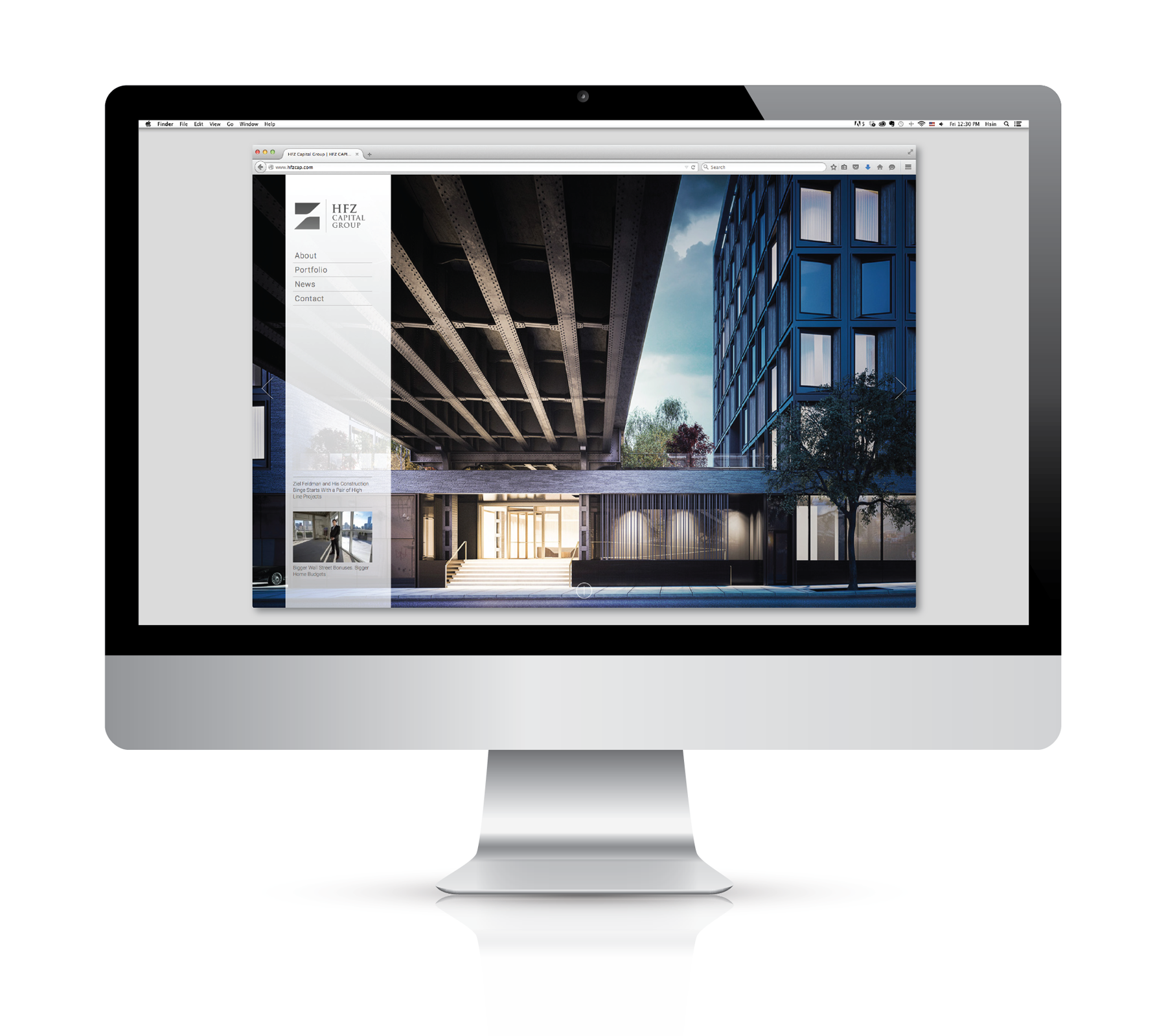
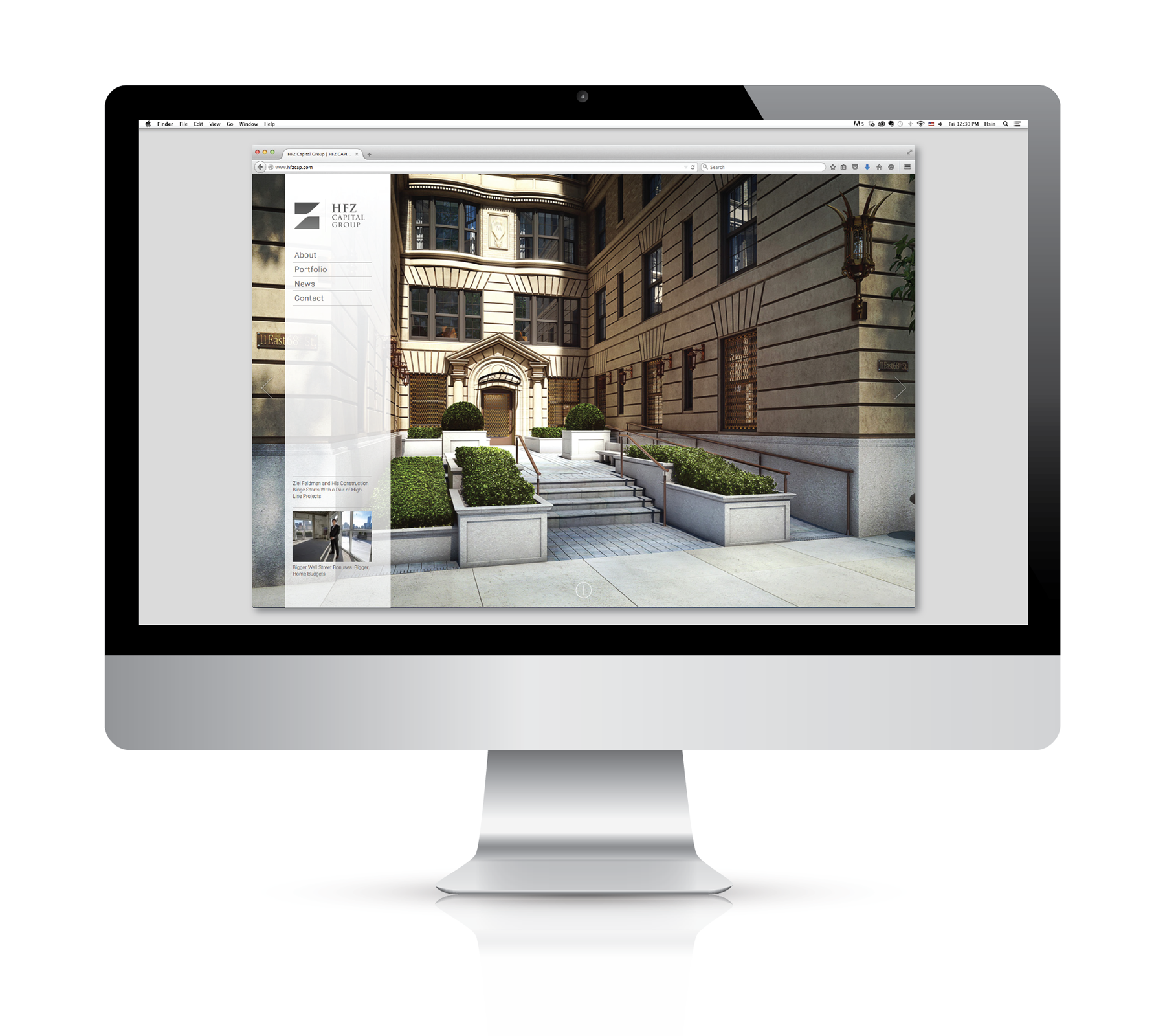
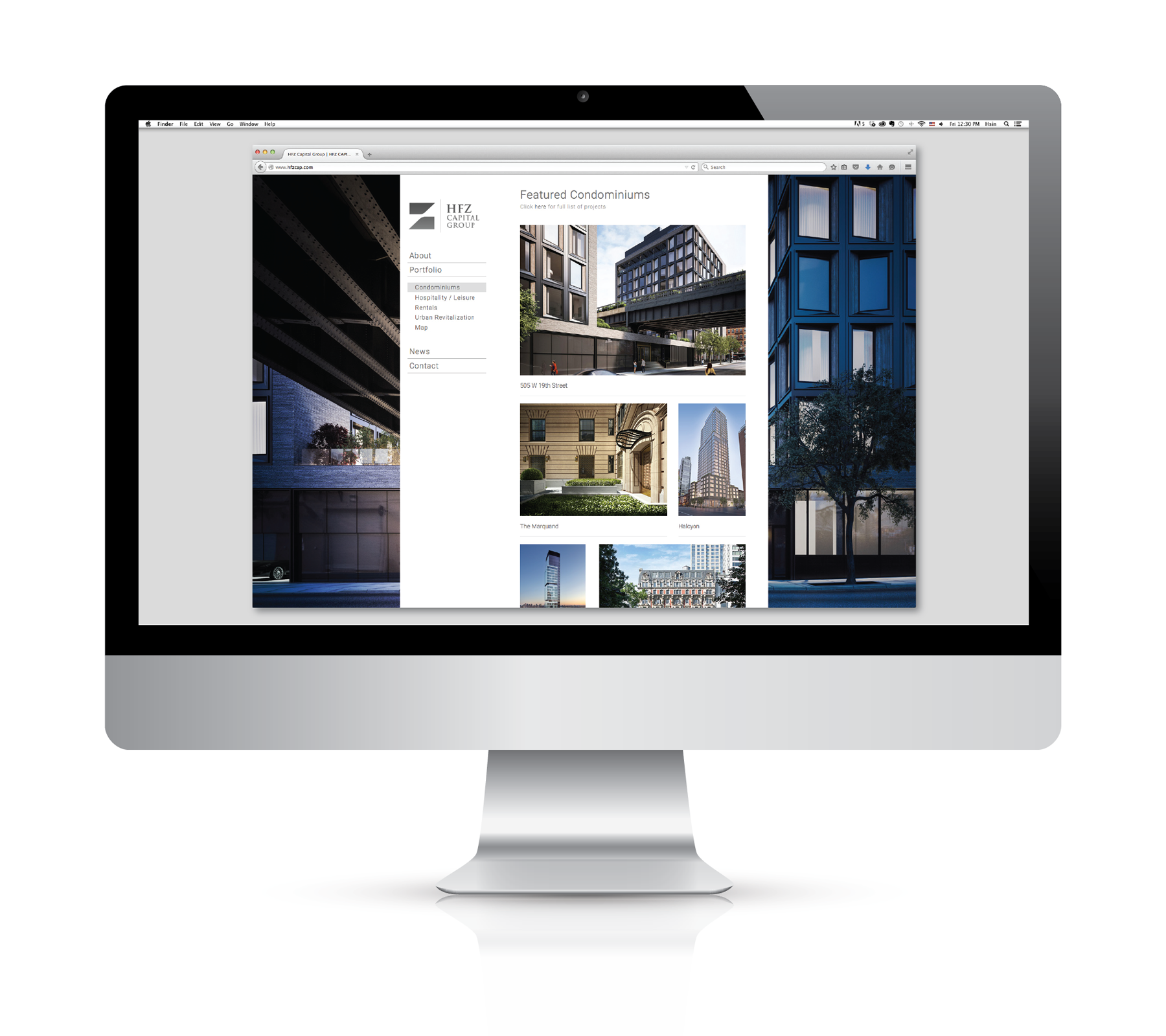
A design motif that celebrates the understated use of white space. The presentation begins with a deceptively simple, minimally tranclucent white vertical navigation bar over a changing landscape of exceptional color photography. Interior sections feature elegant typography on fields of white on which stunning photographs of distinctive residential properties are shown to best advantage.
Brochure
Entitled "BOLD ENDEAVORS. UNDERSTATED APPROACH.", we designed this highly functional tool to help the client tell its story to important audiences. The booklet covers current projects and select past projects, as well as bios of HFZ people.
Photography
Flying Machine selected the photographer Ty Cole, who was able to depict each of the distinctive properties in its best light, yet work together in the same presentation as facets in the portfolio of a single developer.


